
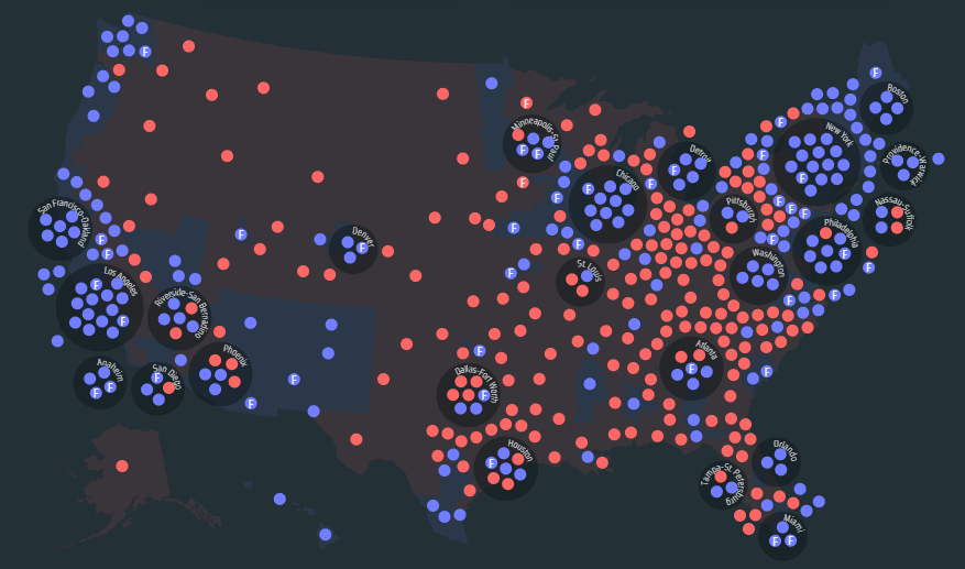
Electing the House of Representatives Link
Within this blog post I will review the above website within the criteria required:
• The purpose of this project was to ‘visualize’ wide swaths of data resources. They want to provide this service to allow explorative efforts in analyzing time and geographical change through, “regional and national patterns” making downloadable and accessible raw data. They recommend to, “watch the expansion of Congress with the American nation.”
• The creation of Electing the House of Representatives project was through the collaboration of the Digital Scholarship Lab, an educational program, at the University of Richmond and the Department of History at Virginia Tech, using interns they checked and improved the data. According to the project information, these interns are those who continue to update and edit this project. The design aspects were designed and developed by Robert K. Nelson, while Justin Madron managed the organization and manipulation of the spatial data. Virginia Tech also utilized a team of students in researching and data processing. Matthew Vaughan planned, researched, and cleaned data; Nick Bolin finalized the project for publication. Research assistants and several history classes were also utilized in the preparations and execution of this project.
• They state that, “users can track their own district’s history” therefore I believe that their aim is for the average American to be able to research the political voting history of their voting district.
• Electing the House of Representatives is a mix of a digital exhibit and an app. It presents knowledge to the general public through the venue of an app as a stand-alone project to accomplish the goals of useability through visualization.
• The aim of the work of this website is to provide simple and user-friendly presentations of wide spreads of complex, lengthy statistics. This is intended then for the wider society to, with more ease, navigate the past elections of the House of Representatives throughout the United States. One can review the changes throughout the country quickly and accurately from districts encompassing smaller, more rural areas, to larger districts including metropolitan areas. One can track the “transformation of party systems and their ideologies, track the career of individual legislators, and watch the expansion of Congress with the American nation.”
• I believe this website does fit into a body of scholarship as it is a presented collection of election statistics which easily fits into a scholarly retrospective analysis of election results through American history.
• The three primary and notable pieces of instructive work on this digital project is the accessibility created through the design of the materials it presents. The project accomplishes this through the choice of methods and how those methods presented the source material.
• How to represent voting for the House across time and space?:
- They represent the strength of different parties over time when any district is selected.
- On the cartograms it is decided that a district will fall within a city if its pole of inaccessibility falls within the boundaries of the census’s metropolitan statistical areas.
- The cartogram is run through D3 force algorithms.
My final thoughts are: Generally, the website is very easy to navigate. Its strong suits lie in the presentation of the large amount of numerical data it comprises, it is very user friendly and simple to understand. The main problem with the website is that the information and data that the website has to shift through in seconds causes a slow and laggy experience on the audience side, even worse if the audience has a slower Wi-Fi connection or computer. Although the design is simple, pieces of the design are bulky and requires specific strolling in just one portion of the screen as it is too small to fit on the whole site. Each visual item is competing for space. The website sacrifices originality in terms of design for the sake of simplicity, which tends to be a strong suit when considering the usability of the tools. The key was to simplify complex sets of data across large spreads of time. These spreads of time ripe with huge amounts of change in the records and understanding of American politics, they accomplish this simplification for uses in analysis.



Sounds like an interesting website to me. I had never thought of examining a district’s political history in terms of how it grew into the state it is today in order to think about what it might do in the future, but now that I have thought about it, it makes perfect sense. That is probably why they are putting it on an app, as people sometimes miss simple ideas and solutions like that since they assume the subject in general is too complicated for them. Putting it on an app simplifies things and makes them more accessible, and in today’s political climate, we need everyone to stay as well-informed as they possibly can.
Tasha, I found your post interesting. This website is basically an election map for every year. I also think your presentation of your blog is good!